Why Brighter Isn't Better Lighting
What is the best light in the world? Sunlight.
Everything else is artificial light, and you spend your whole day inside it. The office. The mall. Your own living room. Have you noticed that office light is white, home light is warm, and shopping-centre light is a warm yellow? None of that is an accident. Every one of those spaces was designed that way.
The industry measures lighting quality with three numbers: brightness, colour temperature and colour rendering index (CRI). All three are objective, physical quantities. And all three are relative. None of them works as “the higher the better.” What actually decides whether a space feels good is something the three numbers do not capture: layers.
A space with no strong and weak light, no visual centre, no hierarchy and no contrast will always feel ordinary.
Brightness is relative
Some spaces genuinely need to be very bright. A discount snack-shop chain sets its stores brighter than every neighbour on the street, and that brightness becomes a visual centre. People, like most animals, are drawn towards light. Warm yellow plus high intensity pulls you in and points you at the door.
Why do clients always ask for brighter? Attention. People are drawn to light, and it works on the same principle as making your sign bigger and bolder in daylight.
Yellow and golden light also sit at the peak of the eye’s sensitivity. That is why children wear yellow raincoats: on a dark, rainy day, yellow is the most visible colour. It is why roads used low-pressure sodium lamps: golden light that stays readable in fog. Insects peak in the blue-violet range instead, which is why bug zappers glow blue or purple.
Now look at a private club, or a resort hotel. Those are places built for rest, and both the colour and the level of the light are kept low. City luxury hotels, on the other hand, are not dim at all, and budget hotels are brighter still. That is because a lighting scheme is designed against the ambient light around it: a resort sits in natural darkness, so it can go low.
But “low” is relative too. Look at a car’s headlights in daylight and they do not bother you at all, because the sun is brighter. Look at the same headlights on a pitch-black road and they are blinding. Same lamp. What changed is everything around it.
That is because your eyes adapt. After a bright stimulus, everything else looks dim; after a few minutes in the dark, you start to see again. Get up at night without switching on a light and you can still find the toilet. Brightness is never absolute. It is always brightness compared with what.
Colour temperature: why offices are white and homes are warm
Offices run at 4000 to 6000K, which imitates daylight between roughly ten in the morning and two in the afternoon. The purpose of an office is focus and efficiency, so it gets cool light. Factories and sports halls are cool for the same reason.
Homes are a different question. Drive past an apartment block at night and you will see both cool and warm windows; people choose either. My advice is warm. Warm light feels like candlelight: the candle you light in a power cut, or the candle on the table at dinner with your partner. What you feel is warmth and intimacy, and that is the job of light in a home.
CRI: there is blue light inside white light
Colour rendering is relative as well. Sunlight scores 100. The old incandescent bulb can also be treated as 100. LED is different: a blue chip excites a yellow phosphor, and the blue and yellow mix into white. So an LED’s white light carries a large blue component, and you can measure it with a spectrometer. White light always has blue inside it, and blue light suppresses both the eye’s comfort and your melatonin.
Layers: the thing that actually matters
The most basic law in lighting is the inverse-square law: light falls off with distance. Light, by its nature, comes in strong and weak.
The best-designed spaces are built on exactly that. A piece of music has tempo and pitch. A painting has perspective, warm and cool colour, saturation, and the light-halftone-shadow structure that gives it depth. A space is the same. It needs a visual centre, and it needs three kinds of light: accent, ambient and task. Every space should have at least three clearly different levels of brightness. Between accent and ambient, a 1:3 ratio is already hard for the eye to read as a difference; 1:5 is the ideal contrast; 1:10 still works.
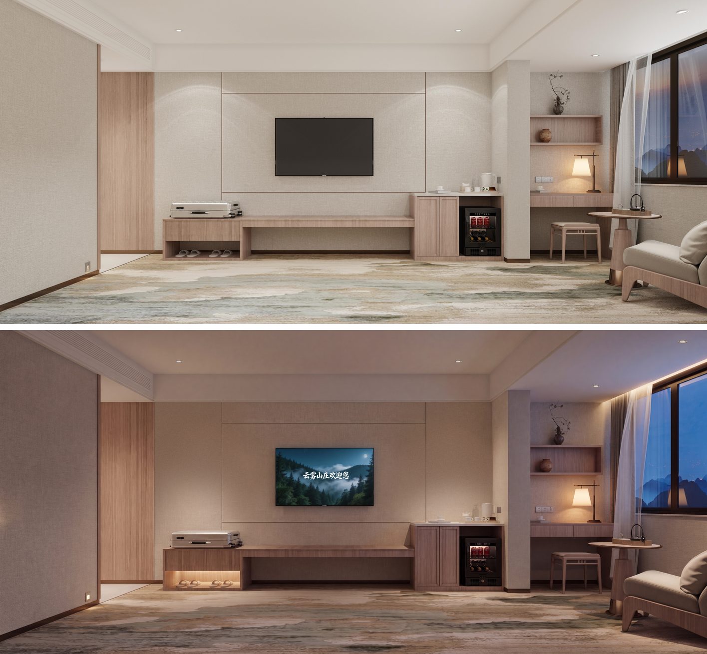
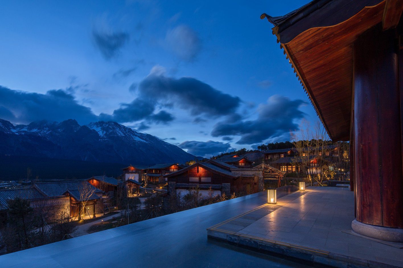
Dark spaces have layers too. In 2014, when I was at BPI, I worked on the Grand Hyatt Lijiang, the Jinmao Snow Mountain Garden project. It sits below Jade Dragon Snow Mountain; every room looks up at the summit, and the whole scheme was conceived as a Lijiang village, under the theme “a home beneath the snow mountain”. In a landscape that dark, what guests come for is quiet and a sense of nature, and the light has to glow warm, like light from inside a cave. The facades carried almost no light. Inside, the accents went to the feature walls, the artwork and the timber structure; the lounges ran on floor lamps. Low level and low contrast overall, and still a visual centre, still task, accent and ambient, still layers.
The opposite is a space where everything is lit. Sunlight is the best light there is, yet daylight has no layers at all: the sun is so far away that its light arrives as parallel rays. A space lit everywhere is daylight indoors, and it always feels ordinary.
I have also worked on a heritage-style tourist street where the decision-makers were older, loved gold, loved bustle, loved bright. The facades ended up carrying far too many fixtures, and the buildings were brighter than the shops inside them. But a street like that exists to sell what is in the shops. The light had taken over the show.
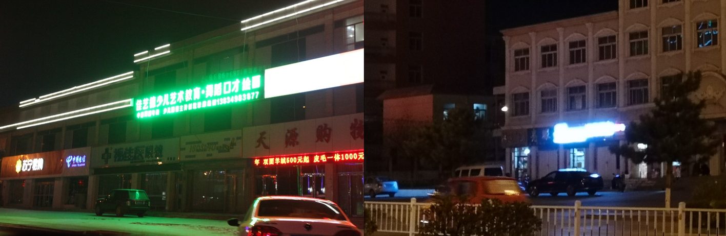
In 2019, in Pinglu, Shuozhou, Shanxi, I saw the other extreme. The shopfronts used exposed-LED channel letters as signs, and the six-to-eight-metre walkway between the shops and the road had no lighting of its own; the only light came from those exposed diodes. In professional terms: severe glare. It is fair to call it a disaster for the whole city.
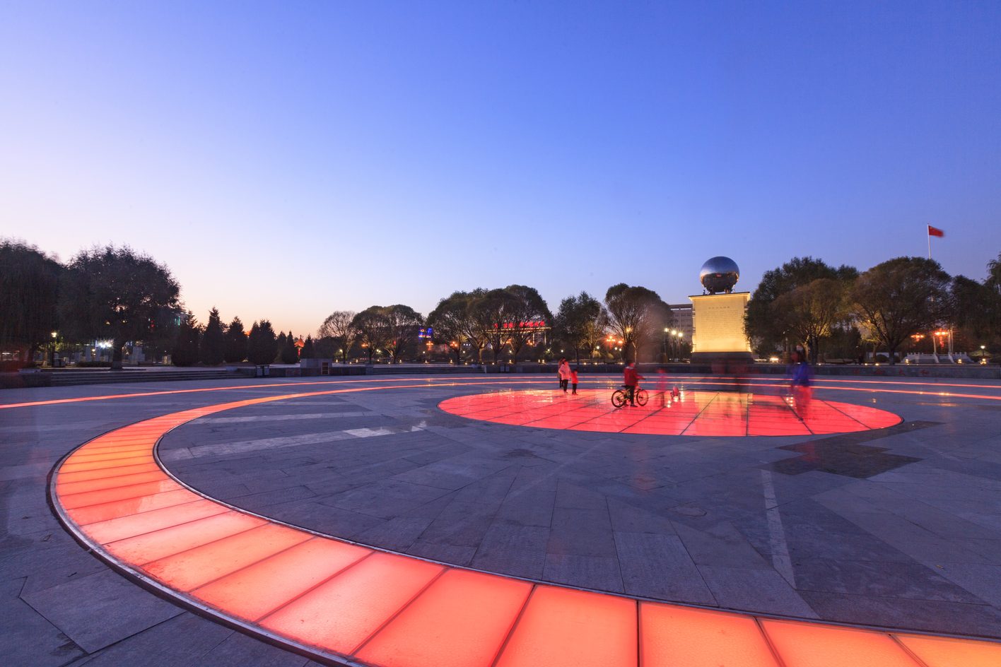
We later did a project in Pinglu ourselves. On the plaza, the accent goes to the sculpture at the centre, the glowing ring in the ground only guides, and the rest stays low. In the park, the trees are the accent, the benches get a low light beside them, and a few points of light in the distance do the guiding.
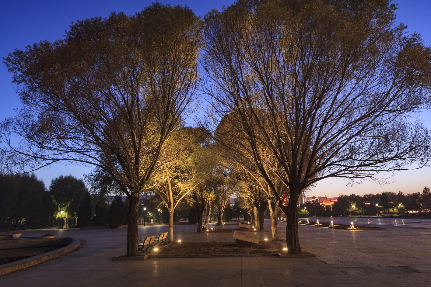
Unrated hotels and low-price retail are the everyday version: bright everywhere, because bright pulls people in, and that is the only thing they design for.
How layers land in a real space
You can tell a professional photographer from an amateur by how they use light; the work shows it immediately. Architecture uses light and shadow to give a space mystery and tension. Night lighting does the same thing through hierarchy, scene by scene.
Take a hotel lobby. The first thing you see is the reception desk, or the feature wall behind it, because the space needs to lead you to check-in. Then the decoration and the lounge seating. Only then are you led to the lifts, to your room or the other public areas.
That order is designed around how people see. Your field of view runs about 30 degrees above eye level and 60 degrees below. Walking into a lobby, your first glance lands on a vertical surface: the desk and its backdrop. Only as you move do you look down at the floor, or up at the ceiling. So hotels put their art and feature finishes on the walls, and the lighting puts its accent on vertical illuminance, lighting the wall rather than the floor. The floor gets just enough light to guide you. In the lounge and the reading corner you find floor lamps, because the closer a person is to the light source, the more comfortable and the safer they feel.
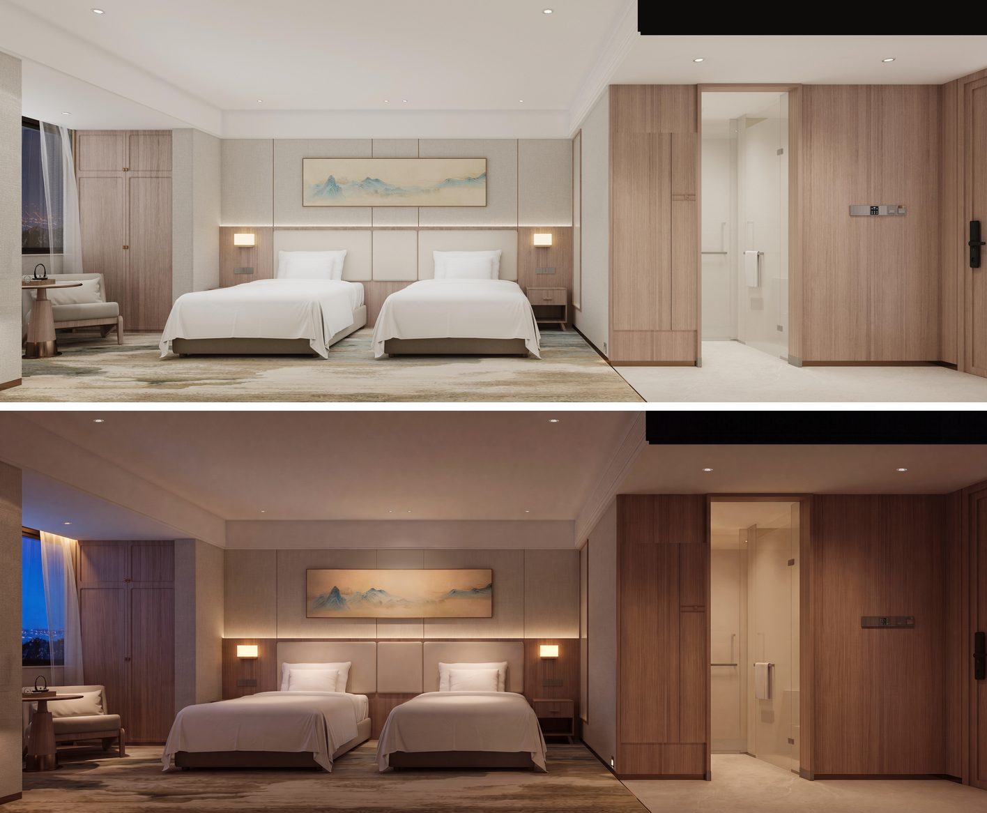
Ten seconds in a shop: does the light have layers?
Start with the overall feel. A layered space is soft and even; the contrast is not harsh and nothing is glaring, and inside that softness there is one visual centre.
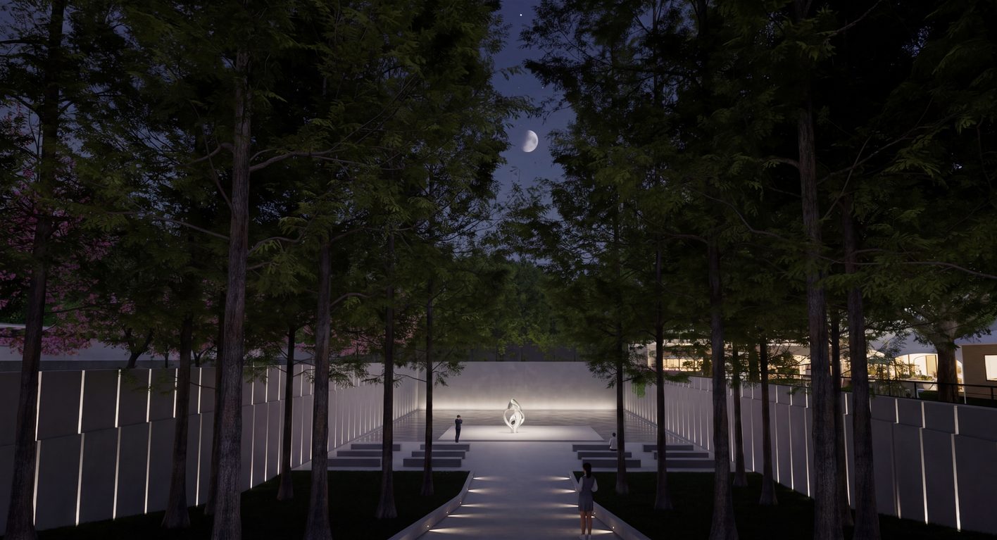
Then look at the ceiling and the walls. You should find three kinds of light: task, accent and ambient. Ambient is mostly cove and strip light, soft and continuous. A shop or a hotel is neither very bright nor very dark; within a moderate range there is a clear hierarchy of contrast.
If instead the contrast is harsh, with glare from the sources, hard hot spots, one feature wall or one decorative fitting shouting above everything else, the lighting was not planned by a professional.
What light is really doing: allocating attention
The commercial nature of lighting is the allocation of a space’s attention budget. Whatever is brightest gets seen, and whatever gets seen first gets consumed first.
The snack chain is spending its whole budget on its own shopfront, at the scale of the street: grabbing attention. The hotel lobby, with its desk, its artwork and its lifts, is ordering attention, writing a visual route for the guest. Lighting everything is spreading attention evenly. No priority, and it reads as cheap.
Where the money for layers actually goes
The first cost is a professional lighting designer.
The second is proper fixtures and dimming. Ceiling positions differ, material reflectances differ, and procurement has its limits, so a designer does not specify a different wattage for every position. You pick one, say 9 watts, knowing some zones only need 6 and others need 12. Then you add control: dimmable drivers, a chip in the fixture, so every lamp can be set to the level the space needs.
The third is commissioning on site. Every fixture is aimed by hand and every lamp is set to its level, one by one. That is where the hierarchy actually gets made.
So the money for layers does not go into more expensive lamps. It goes into people and dimming.
Light and material
There is one more relationship: light and material. Light reflects off whatever it lands on, so it has to adapt to the materials in the space. Sometimes it should bring out the grain and texture of a surface; sometimes it should play it down. The intensity of light can shape how any object or material in a room expresses its texture.
So lighting design really does three things. It organises the space with contrast. It guides people’s movement with the distribution of brightness. And it shapes how materials feel.
What makes a space feel refined
A refined atmosphere comes from the relationships of contrast, the layout of the light, a single colour temperature, and the texture of materials in their own colours. What it produces is a simple order, a unified tonality, and rich, fine texture. The main tools are still contrast, strong against weak, and visual guidance, used to organise the space.
Take a pure church: all-white materials, white light at 4000K or 3500K inside and out, and what comes through is sacredness and purity.
Or a Buddhist temple project in Sichuan that BPI worked on, with a circular blue room inside: blue light makes the space feel boundless. At the centre, under the dome, a single beam of warm light falls on a pool of water. A pure blue key with one warm accent, and the room turns contemplative, almost sacred.
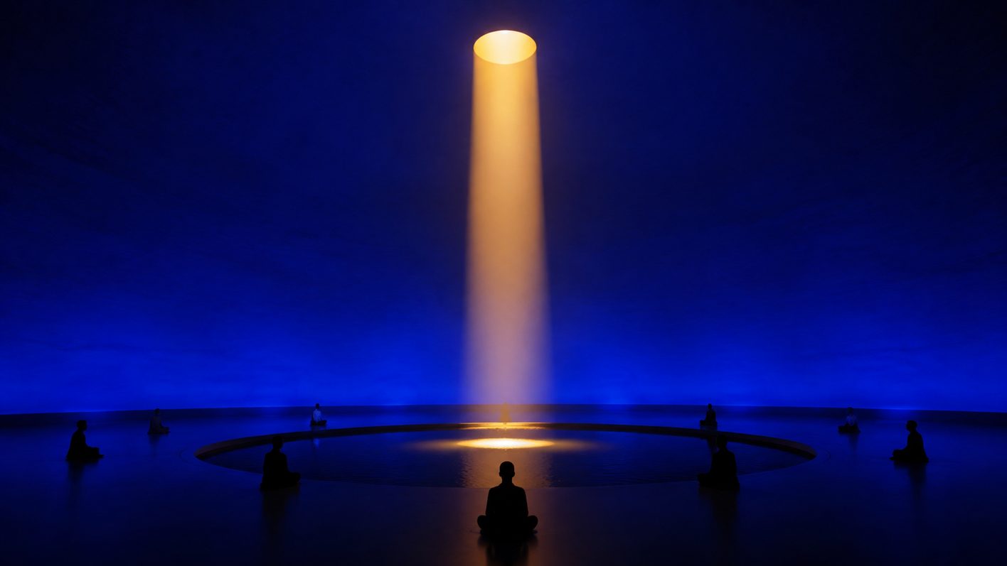
Pure colour of light, plus a planned hierarchy of brightness, can make a space feel weightless and sacred. It is the kind of space that puts people into flow.
Light is the soul of a space. It is also the most cost-effective material in it.
FAQ
Are luxury hotels always dim? No. City luxury hotels are not dim, and budget hotels are brighter still. Resort hotels can go low because they sit in natural darkness, and a lighting scheme is always designed against the ambient light around it. A low-level space still has a centre and three layers; it just sets the whole scale lower. The Snow Mountain Garden at Grand Hyatt Lijiang is exactly that.
Should my shop be brighter than the one next door? Think in attention. The snack chain out-brightens the whole street to grab it; a hotel lobby lights the desk and keeps the rest low to order it. Lighting everything is spreading attention evenly, with no priority. And bright is not the same as glare: hard hot spots, exposed diodes, one fitting shouting above the rest all read as unprofessional.
What accent-to-ambient ratio works? At 1:3 the eye can barely tell the difference. 1:5 is ideal. 1:10 still works.
Why is office light white, and what should I use at home? Offices use 4000 to 6000K cool light because the job is concentration. At home, go warm: it reads as candlelight.
What exactly are the “three layers”? Accent lighting (the visual centre: a feature wall, a piece of art), ambient lighting (the overall level, mostly cove and strip light), and task lighting (the reading lamp, the desk). Every space should show at least three clearly different brightness levels.
Try it on a daytime photo
Layers are invisible in daylight; that is the whole problem. If you work on building exteriors, upload a daytime photo to LDR and let it draft a night scheme first, then look at how the crown, the facade and the ground floor are separated. You get 5 free credits on sign-up, one free generation a day after that, and credits never expire. For where AI rendering fits alongside sketches, BIM and physical models, see 5 lighting design visualization techniques; to skip prompt-writing entirely, see night rendering without writing prompts.